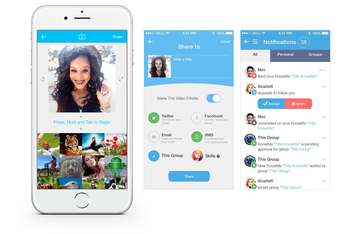
The MVP as inherited from the third-party vendor, pre-launch
What repeated redesigns taught us about the difference between usability and product value.
I inherited an MVP built by a third-party vendor with no research behind it, due to launch in a few months. We brought product development and engineering in-house — and over the next year, rebuilt the core creation flow three times as our understanding of the actual problem kept changing.
The MVP as inherited from the third-party vendor, pre-launch
When I joined in January 2015, an outside vendor was building toward launch in a few months, with slow turnarounds, top-down product decisions, and features added with no qualitative or quantitative data behind them. I brought that process back in-house. Early testing showed the Creation screen — the core of the product — was overloaded with icons and unfamiliar gestures. The team's first instinct was that users just needed to learn the interface better.
Stakeholders initially blamed users for not understanding the new gestures. But watching people actually try to use it, the problem wasn't unfamiliarity — it was cognitive overload built into the interface itself. The team agreed: it was us, not the user. That reframing is what let us stop trying to fix users through onboarding and start fixing the product.

The MVP creation screen that prompted the reframe
After the MVP shipped in January 2016, we iterated on several onboarding approaches — a forced walkthrough, animation, a progressive tutorial — while trying not to lean on onboarding as a crutch for an interface that should have been intuitive enough to explain itself.
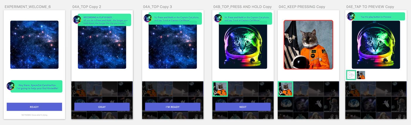
Onboarding explorations
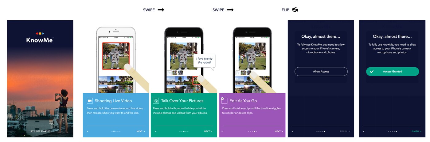
Onboarding explorations, continued
Based on user testing data, I simplified the Creation screen itself rather than continuing to patch it with onboarding — removing the interface elements that were causing the overload and restructuring the layout around the one thing people actually came to do. User feedback turned positive, and engagement metrics showed early signs of improvement.
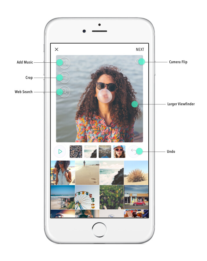
The simplified creation screen (v2)
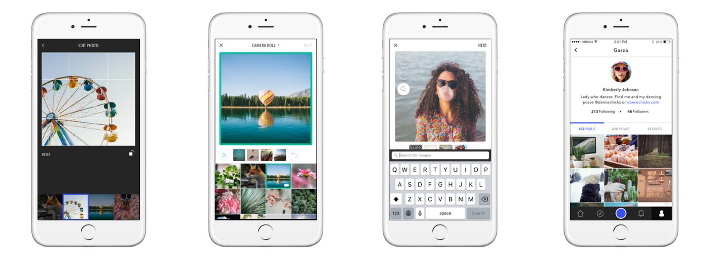
Supporting screens: Edit, Talk over Media (Create), Web Search, User Profile
After v2 shipped, usability had genuinely improved, but our user base kept shrinking. That's what pushed the team to ask a harder question than "is this easy to use": what is the core value here, and are we actually delivering it before anything else gets in the way?
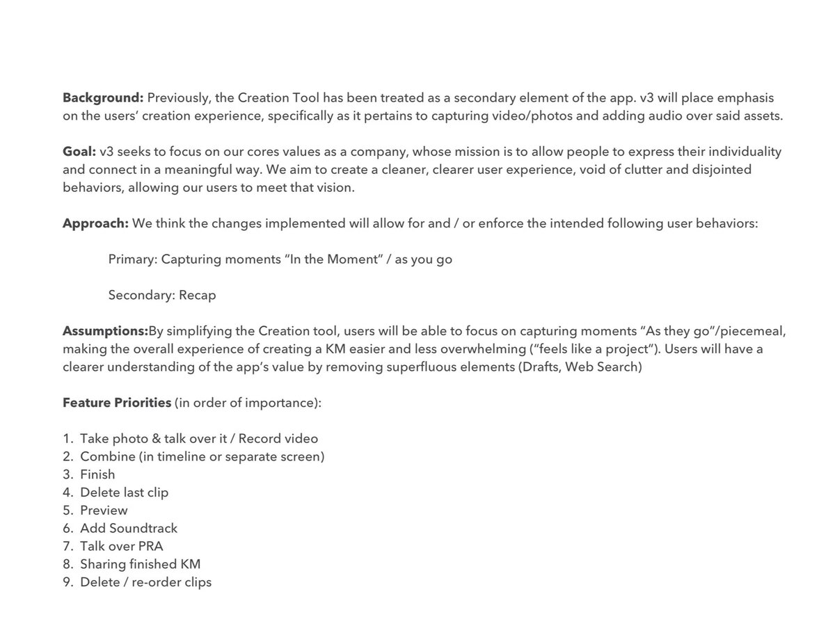
Realigning the product to its core mission and cutting everything else — the key decision behind v3
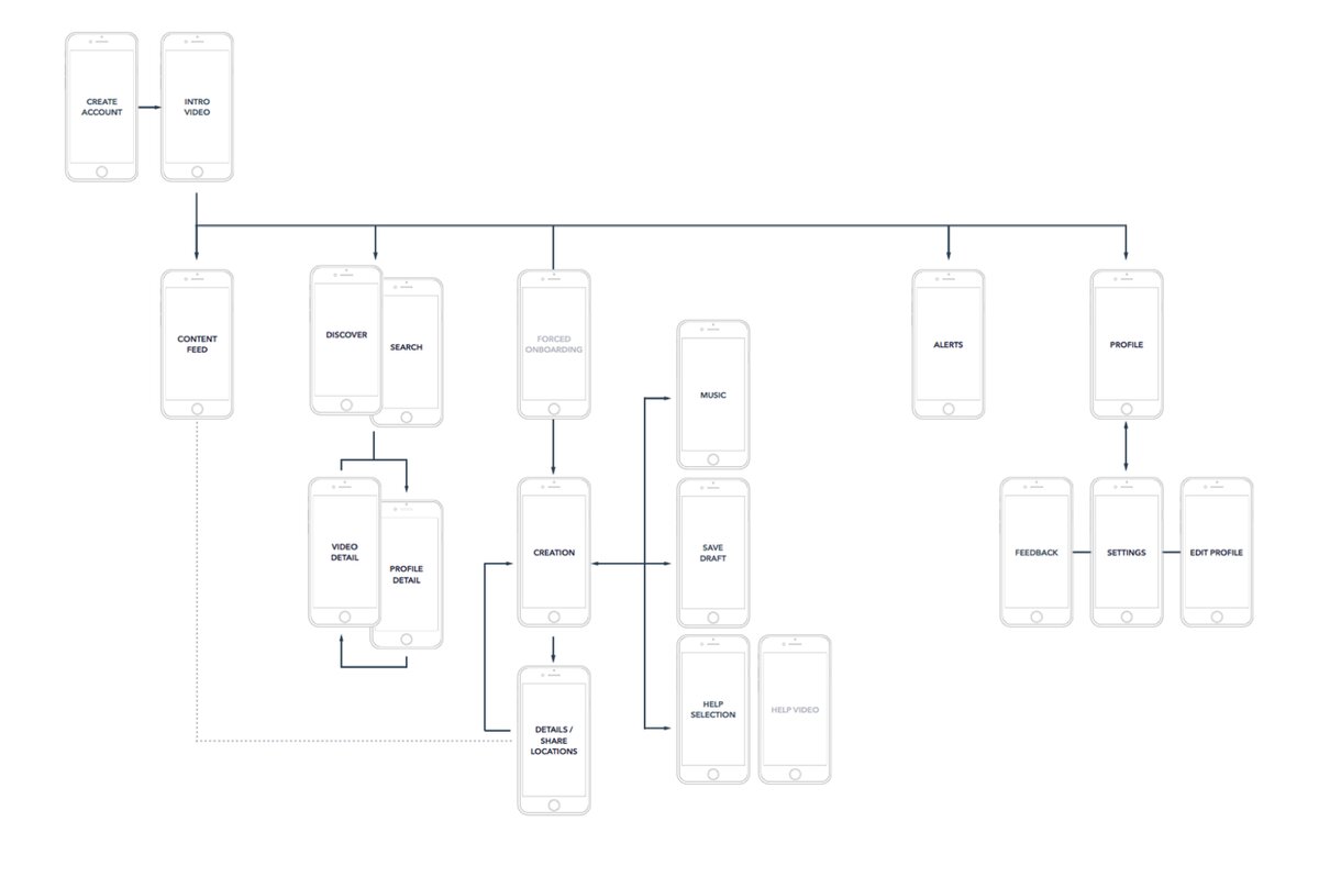
Proposed simplified flow
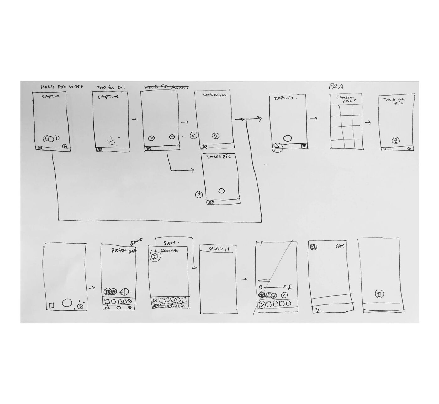
Sketches for v3
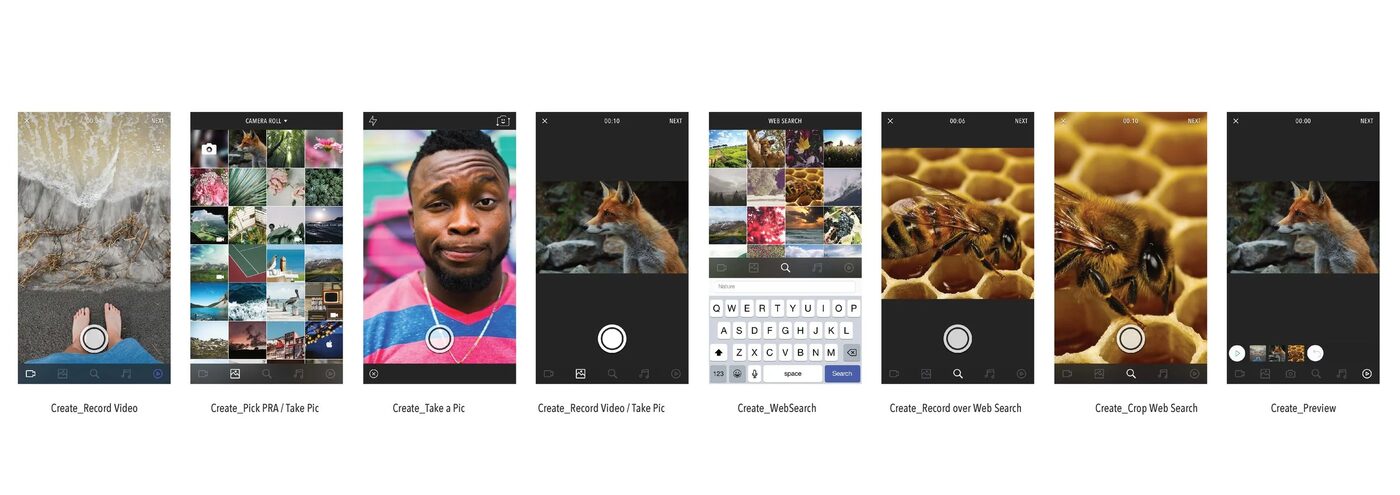
v3 explorations
By v3, we chose to stop expanding features and concentrate entirely on the core creation screen — even where that meant walking back earlier feature bets. This is the part of the work I still think about most: we had made the product genuinely easier to use, and usage kept declining anyway. Usability and value aren't the same thing, and improving one doesn't automatically fix the other.
Research isn't only for validating a solution. Sometimes its most important job is telling you that you're solving the wrong problem. Every round on KnowMe made the product easier to use, but usability was never actually the fundamental issue — and it took us three tries to be willing to ask the harder question underneath it.